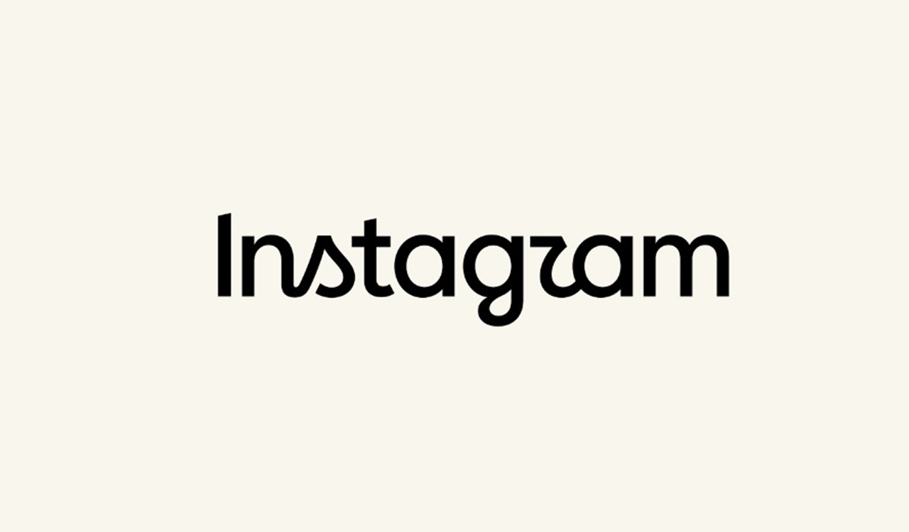
Instagram has refreshed its wordmark for the first time in a decade, giving it a bolder, simpler look. The redesign has drawn mixed reactions online, with some users praising the change while others joke that the new lettering reads “Instagzam”.
Updated On – 17 August 2026, 01:29 PM
Hyderabad: Instagram has refreshed its wordmark for the first time in a decade, giving its familiar cursive lettering a sharper and more contemporary appearance. While the update is meant to modernise the platform’s identity, some users have already found a rather unexpected detail, the new design appears to read “Instagzam” to them.
“The wordmark at the top of the app hasn’t changed in 10 years, so it was time for a refresh. Cleaner and more modern, with references to the original and the simplicity and craft that’s always made it Instagram,” said Adam Mosseri, head of Instagram.
The redesign came after Instagram’s design team experimented with hundreds of possibilities, including different lettering styles and handwritten options. The final version retains a flowing script style, but gives it a bolder and simpler appearance.
“Script reflects individuality, so referencing that felt right. The new wordmark is bolder and simpler, with touches of unexpectedness,” said Jasmine Probst, Instagram’s director of product design in a news release.
The changes extend beyond the wordmark. Instagram is also introducing an updated version of its Instagram Sans typeface, along with Instagram Pen, a hand-drawn font, and Instagram Mono.
While some users have welcomed the cleaner look, others have questioned the readability of the new lettering. The unusual appearance of the “r” has particularly caught attention, with several people joking that the platform now looks like it says “Instagzam”.
The redesign has therefore sparked a mix of appreciation, criticism and humour online, proving that even a small change to a familiar brand can get people talking.