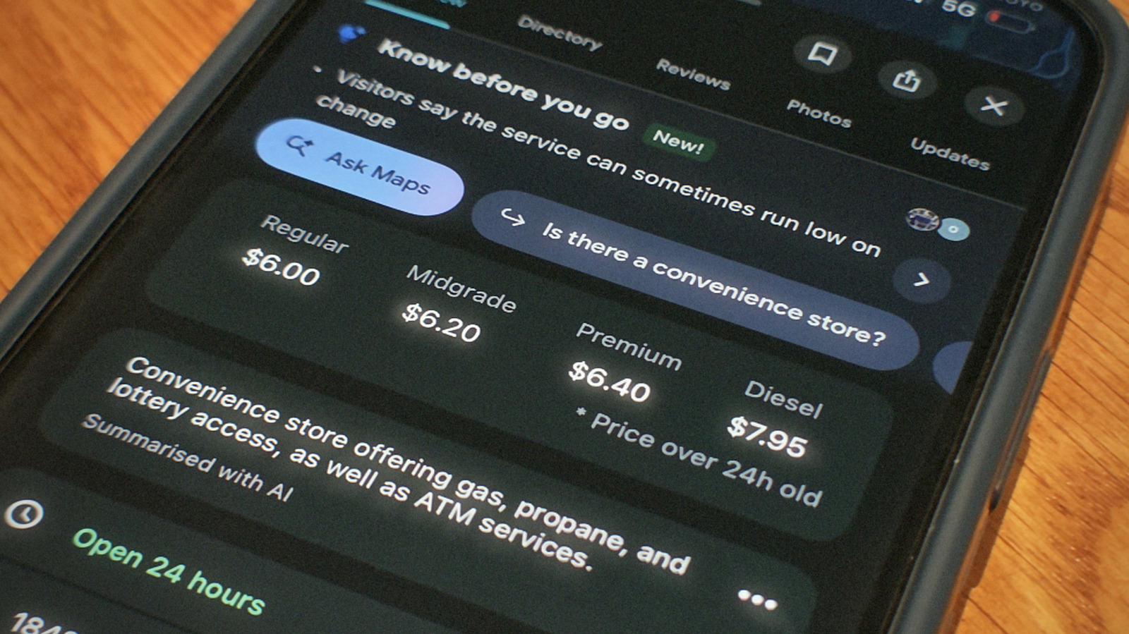
Google sits on a mountain of maps data, but not all of it is its own work. Sometimes the company relies on third-party data providers to fill in any gaps in its knowledge. Gas prices are one of those gaps. If you’ve never used it, the Maps app presents gas information with every gas station listing when you search for it, so you can pick the cheapest option in your area. The data for it actually comes from a Dow Jones-owned firm called OPIS, short for Oil Price Information Service. This firm’s entire business is selling fuel pricing data to companies that need it.
Neither company actually promotes this arrangement, although both do admit to it in their documentation. On the OPIS website, you can find a page where the firm markets its retail fuel pricing products. Google is named here as a customer for its station data. Google sort of confirms this from its own end in a Maps support article on reporting bad map data. It instructs anyone who spots a wrong gas price to contact OPIS about it, rather than Google.
Maps first got gas prices back in 2015, over a decade ago now, with Android users seeing them first that October and iPhone owners waiting until December. As for whether they’re actually correct, the short version is that they hold up pretty well as long as you use them to get a general picture of what fuel costs in your area. Any single station’s number, though, can lag reality by a day or more, since gas prices shift constantly — and lately they’ve been climbing harder than they have in years.
So how accurate are those prices?
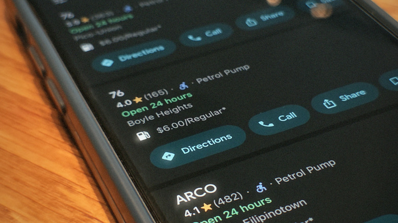
Nearly one in four American gas stations transmits its prices to OPIS directly, every day. Besides that, OPIS has also revealed that it builds averages from reconciled credit card transactions. In a way, consumer payment records double up as price reports.
While most of this data handed over by OPIS is accurate, there are times it may not be — and Google is upfront about those times. As seen in the above image, Maps sticks an asterisk on prices it isn’t confident about, noting they’re from 24-plus hours ago. Android Authority also found that prices at major chains like Shell and BP generally matched reality. The gaps show mostly with fuel types other than regular unleaded, since those are updated more slowly. Another weak point are warehouse clubs. Costco and the like frequently showed no price whatsoever.
The point of asterisks is to account for fast-moving gas prices, which often update faster than any data pipeline can keep up with. GasBuddy, a platform that helps drivers find the cheapest gas nearby, reckons a single station can change its price up to three times in one day. OPIS does refresh nearly 90% of stations daily — a number that climbs up to over 95% within 48 hours. That leaves a slice of listings trailing whatever the sign outside actually says. OPIS also claims to be the only provider pulling data from multiple independent sources for the same station. It uses these sources to cross-check data just in case something looks off.