
Modern digital products often contain hundreds of interface elements, from buttons and forms to cards, navigation menus, and headings, that may appear across multiple pages and features. Without a shared styling approach, small differences can gradually make an interface feel inconsistent.
Design tokens provide a structured way to manage these visual decisions. Instead of repeatedly defining individual colors, font sizes, or spacing values throughout a codebase, teams can store them as reusable design values.
This connects design and frontend development more closely and gives teams a common foundation for building and maintaining interfaces.
What Are Design Tokens?
Design tokens are named values that represent reusable design decisions.
Token values can describe colors, spacing, typography, border radii, shadows, and other visual properties.
For example, instead of defining a particular shade of blue separately for every button, a product might use a token such as “color-primary.”
Multiple components can then reference the same token. If the brand color changes later, the team can update the shared value rather than searching through every component individually.
Shared Color Tokens Keep Interfaces Consistent
Color tokens are among the most common design tokens. A product may define values for primary colors, backgrounds, text, borders, warnings, and success states.
Imagine a dashboard where five different developers have independently chosen slightly different shades of grey for secondary text. Each choice may look acceptable on its own, but together they can make the interface feel poorly coordinated.
Shared color tokens create a common visual language. It can also make changes easier when a product introduces dark mode or refreshes its brand identity.
Spacing Tokens Create Visual Rhythm
Spacing affects how users understand relationships between interface elements. Inconsistent gaps between headings, buttons, and sections can make an otherwise functional interface feel messy.
Spacing tokens provide a defined set of reusable values. A team might establish standard spacing levels for small gaps, component padding, and larger section separation. Developers can then use these values instead of repeatedly choosing arbitrary measurements. This creates a more predictable layout across the application.
For example, forms throughout a product can use the same spacing between labels and input fields, creating a consistent experience even when different teams build those screens.
Typography Tokens Build a Clear Information Hierarchy
Typography tokens can define font families, sizes, weights, line heights, and other text properties. A design system might establish separate values for page titles, section headings, body text, captions, and labels. Components can then use those predefined styles rather than creating their own variations.
This helps users recognize information hierarchy more easily. It also prevents a situation where one page uses a particular heading size while another page uses a slightly different size for the same purpose.
Typography tokens become especially useful as products support multiple platforms, responsive layouts, or different interface themes.
Tokens Help Designers and Developers Work Together
Design tokens can act as a shared language between design and engineering teams. Designers can define a consistent set of visual decisions, while developers implement them using the same underlying values.
This can reduce misunderstandings during design handoffs. Instead of describing a color as “the dark blue used on the main button,” teams can refer to a specific design token. When the design system changes, both sides can also work from the same source of truth.
Design Tokens Support Themes and Customization
A centralized token system can make it easier to support multiple themes. A product may need light and dark modes, different brand variations, or interfaces customized for different customers. Rather than rebuilding every component, teams can change the values behind the tokens.

For example, a white background token in a light theme could map to a darker background value in a dark theme. The components themselves can remain largely unchanged. This makes tokens useful not only for consistency but also for creating flexible interfaces.
Tokens Improve Frontend Maintainability
As a frontend grows, maintaining repeated style values becomes increasingly difficult. Developers may have to update the same color, spacing value, or typography setting across dozens of files. Design tokens reduce this duplication by centralizing important design decisions.
A change to a shared value can flow through multiple components that depend on it. This can also make code easier to understand. A token such as “spacing-large” communicates more design intent than a random numerical value with an unclear purpose.
Tokens Can Support Accessibility
Design tokens can also help teams make accessibility a more consistent part of frontend development. Instead of treating accessibility as a separate check for individual screens, teams can build certain requirements into their shared design values.
For example, color tokens can be selected with sufficient contrast between text and backgrounds, while typography tokens can establish readable font sizes and line heights.
Spacing tokens can also provide enough separation between interactive elements, making interfaces easier to navigate. When teams define these decisions centrally, developers are less likely to create inaccessible variations across components. A token spacing-large can also communicate design intent more clearly than an unexplained numerical value.
Tokens do not guarantee an accessible product on their own, but they provide a stronger foundation for applying accessibility principles consistently throughout the interface.
They Need Structure to Stay Useful
Creating tokens alone does not guarantee a good design system. Poor naming, unnecessary variations, and inconsistent usage can make a token library difficult to manage. Teams should establish clear naming conventions and decide which values genuinely need to become shared tokens.
A system with hundreds of nearly identical spacing or color values may create more complexity than it removes. Also document how tokens should be used. Developers need to understand when to use an existing token and when a new value is actually justified.
Design Tokens and Component Libraries Work Together
Tokens become even more powerful when combined with reusable component libraries.
A component library can define how buttons, inputs, and cards behave, while design tokens define the visual values those components use.
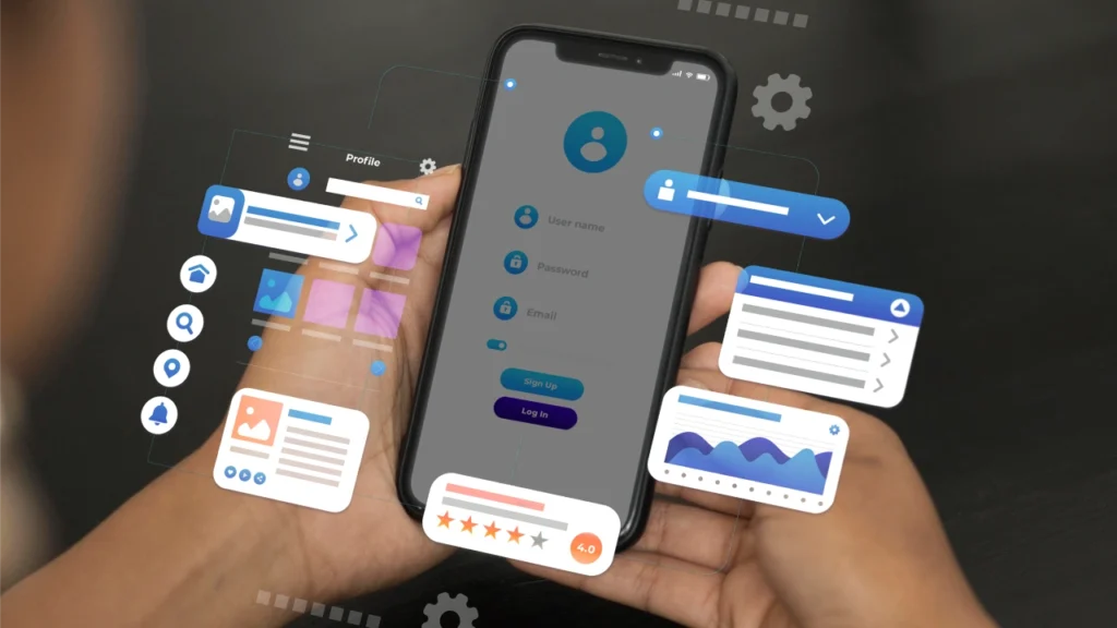
For example, a button component can reference shared tokens for its color, spacing, typography, and border radius. If the design language changes, the component can inherit updated values without manually redesigning every button instance.
This creates a stronger connection between the design system and the frontend architecture.
Conclusion
Design tokens provide a practical foundation for maintaining consistency across modern digital products. Shared values for colors, spacing, and typography help teams avoid unnecessary variations while making visual changes easier to manage.
Their value grows even more as a product expands across multiple pages, teams, and platforms. When tokens are combined with clear naming, documentation, and reusable components, they can make frontend architecture more scalable and easier to maintain.
Rather than treating design as a collection of individual styling choices, tokens turn those choices into a structured system that designers and developers can build on.