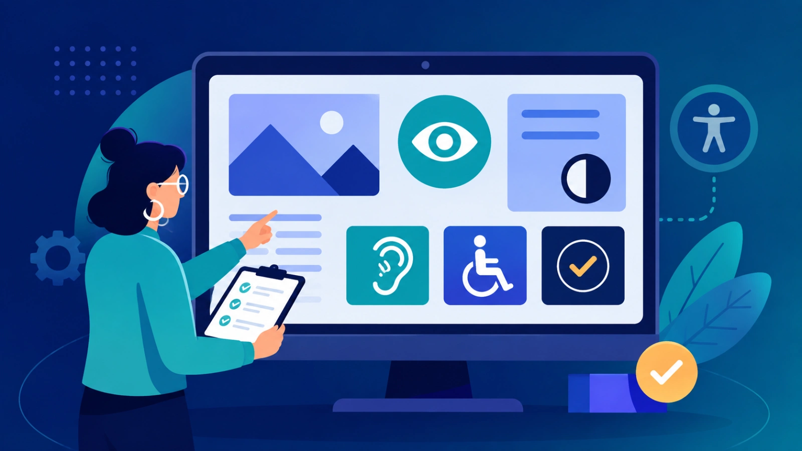
A website can load quickly, look attractive, and perform every function correctly yet still be difficult, or even impossible, for some people to use. You know, it can look fine on the surface, but when someone tries it with different tools, it can suddenly go sideways.
For example, a navigation menu might seem perfect with a mouse but become inaccessible to someone relying on a keyboard. A form may appear simple visually but fail to properly announce its labels to a screen reader. Text may look acceptable to designers but turn out hard to read because of insufficient color contrast. And yes, these issues are not always caught during normal software testing.
So you need another kind of question:
Can people with different abilities actually use this website successfully? That question is the point of web accessibility testing.
Accessibility testing checks whether digital content can be understood and operated by people with different abilities, and also by different assistive technologies. The Web Content Accessibility Guidelines (WCAG) frame accessibility around four fundamental principles: content should be perceivable, operable, understandable, and robust.
For modern frontend teams, accessibility matters extra because many barriers start directly in HTML, CSS, and JavaScript. A tiny development decision can decide whether an interface feels smooth for a keyboard user or a screen-reader user. Because of that, accessibility can’t be treated like a feature you add after everything is done. It has to be considered from the beginning.
What Is Web Accessibility Testing?
Web accessibility testing is the process of checking a website or web app to find obstacles that might stop people with disabilities from reaching, reading, or otherwise using digital content. In practice, it is less about “passing” a checklist and more about spotting the small hitches that keep things from working the way they should
It can include things like:
- Keyboard navigation
- Screen-reader compatibility
- Color contrast levels
- Clear focus indicators
- Forms and labels
- Images and alternative text
- Headings, plus page structure
- Interactive controls
- Dynamic content behavior
- Zoom support and text resizing
The most solid approach is usually a blend of automated checks, hands-on testing, and, when possible, testing with real people who rely on assistive tech.
Automated scanners can catch many technical issues, though accessibility is ultimately a usability matter. A tool might say an element has an accessible name, for instance, but it may not verify whether that label actually helps a person who is moving around the app. That is why web accessibility testing needs both technology and human judgment, not just one or the other.
Accessibility Belongs in Frontend Development
Frontend development affects how people use a digital product in the real world. With HTML, you get the structure; CSS handles the presentation; and JavaScript does most of the interaction.
But each layer can accidentally add accessibility barriers, and it can happen quietly. For example, a developer might build a clickable element that just looks like a button. To a mouse user, it may feel perfectly fine. Yet for a keyboard user, reaching it can be less natural, and a screen reader might not even recognize it as a button, or at least not in the expected way.
That is why semantic HTML is one of the easiest ways to improve accessibility. Genuine already brings built-in browser behavior and assistive technology support. So, developers should rely on native HTML elements whenever possible rather than rebuilding the same behavior with custom code just because it looks similar. This also keeps frontend code cleaner and easier to maintain over time.
Keyboard Navigation: The Simplest Accessibility Test
Honestly, one of the better accessibility checks needs no special software. Just put away the mouse for a moment. Then try navigating the whole website using only the keyboard.
People should be able to move around interactive parts using Tab and Shift + Tab. They also need to activate controls, work with menus, finish forms, and use dialogs. If some key task can’t be reached or handled with the keyboard, then the interface basically creates an accessibility barrier, even if everything looks fine with a mouse.
Also, focus visibility matters just as much. When someone tabs through a page, they must see where they are right now. If the browser’s normal focus outline is removed without a replacement that’s clearly visible, navigation can become painfully hard, and people will get stuck.
Keyboard testing is extra useful because it often surfaces issues that automated tools don’t explain straightforwardly, or they miss entirely.
Screen Readers And The Accessibility Tree
Screen readers let people with visual disabilities move through websites via spoken output or other assistive interfaces, depending on how the setup is. Some well-known options are NVDA, JAWS, VoiceOver, and TalkBack. They lean on the semantic information that the browser provides, not just layout.
So a screen-reader user might browse a webpage by jumping between headings, links, buttons, landmarks, and form fields rather than reading everything from top to bottom as a narrator would. Because of that, semantic structure ends up being very crucial, maybe even more than it sounds.
Developers should also check, at least:
Headings are arranged in a sensible order. Buttons share a clear purpose, not something vague. Links use meaningful names so you can tell where they go. Form fields have labels that actually match what’s being asked. Images include useful alternative text when it’s needed. Dialogs report their status, such as when they open or close. Dynamic content changes are announced correctly, not silently swapped out. In the end, a website can look completely polished on screen, and still become a frustrating experience for screen-reader users.
Color Contrast, A Critical Visual Test
Color contrast is yet another big part of accessibility testing. It’s not optional, really. Modern interfaces often lean on subtle tints and low-contrast design bits. Sure, they can look kind of elegant at first glance, but if the contrast is too weak, text, buttons, and other controls can become hard to spot, especially for people with low vision.
WCAG 2.2 Level AA guidance usually says you should meet a contrast ratio of at least 4.5:1 for normal text and 3:1 for large text. That’s the general rule of thumb.
But contrast testing should not stop at the typical body text. Developers have to think about more varied surfaces, such as:
- Buttons
- Form inputs and form fields
- Navigation elements
- Placeholder text
- Icons
- Focus indicators
- Status info
Also, color should not be the only way to convey meaning or signal an outcome. For instance, an error message should not depend only on changing a field to red. Instead, add a clear written note, or use an appropriate visual cue so the message lands for more users in a reliable way.
Forms: Small Errors With Big, Lasting Consequences
Forms are super important because they often stand at the place where users finish something crucial, you know. An inaccessible form can block someone from doing key things, like:
- Creating an account
- Purchasing a product
- Making a payment
- Booking an appointment
- Applying for a service
Every single field should carry a label that’s clear and also meaningful. Error messages should not just show failure; they should say what happened and what the person can do next to fix it. Users who rely on a keyboard should be able to travel through fields in a sensible order, while screen reader users should understand what each control is for, and what its current state is.
So a form that technically submits fine, yet can’t be actually completed by some people, is not a successful frontend implementation.
Accessibility And Interfaces That Use Lots Of JavaScript
Modern websites these days kinda act like applications. Menus, modal dialogs, carousels, tabs, autocomplete fields, notifications, and even dashboards can all change on their own without a full refresh. This behavior can bring extra accessibility headaches, even if the page looks fine at first glance.
For instance, when a modal opens, keyboard focus should shift in the right place, not somewhere random, and people should also figure out that a new “layer” of the interface has shown up. And if a dynamic notification pops in, users who rely on screen readers or other assistive tech may need a proper announcement; otherwise, it feels invisible or just confusing.
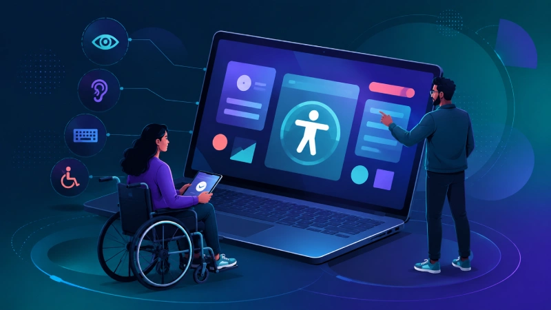
Custom dropdowns, tab sets, and other interactive widgets also need to clearly say their roles, current status, and what actions are actually available. That’s one reason accessibility really has to be tested after the JavaScript functionality is working, rather than just trusting static HTML checks alone.
ARIA: Helpful But Not A Sure Fix Everywhere
Accessible Rich Internet Applications, ARIA, gives extra roles, properties, and states that help you signal what’s happening inside your custom interface, sort of. But no, ARIA is not some kind of complete replacement for semantic HTML. A developer can’t just throw an ARIA role onto something that is already inaccessible, then pretend it’s all done. That’s the thing people miss; it’s not just about naming.
If a custom control is described like a button, it really has to behave like a button too, not merely “sound” like one. And if that component is meant to follow a specific keyboard interaction pattern, the behavior has to be implemented the right way, step by step, no skipping around.
Overall, the idea is pretty straightforward, kind of dull even: Prefer native HTML when you can, use ARIA when you must, and always review what you built with actual testing.
Automated Accessibility Audits
Automated tools have become an important part of today’s accessibility workflows, you know. Tools such as Lighthouse, axe, WAVE, and Accessibility Insights can spot a lot of everyday problems, including some contrast failures, absent labels, and markup that turns out to be a bit problematic. They are especially handy while you are still building, because they can catch regressions before a site lands in production. Still, automated testing has clear limits too.
It can’t fully judge whether content is logically understandable or if the heading hierarchy really makes sense, or if a button’s name is helpful in context. It also can’t tell if keyboard controls feel intuitive, or if what a screen-reader experience delivers is actually usable in practice. So automated audits should be treated as just one layer of testing, not some final accessibility certificate.
The Future of Web Accessibility Testing
Frontend development is getting more and more sophisticated lately. AI-generated interfaces, customized websites, voice-based interfaces, and super dynamic applications will bring new accessibility problems or quirks.
Automated accessibility tools are probably going to become smarter too, so they can spot issues more reliably, and maybe even recommend a fix while people are still building. At some point, AI might also scan components for missing semantics, uneven keyboard behavior, and other accessibility risks. Still, human testing will remain essential, because accessibility is ultimately about people.
And nothing automated can fully copy the lived experience of every user, on every device, with every assistive technology. So the road ahead will likely mix automated checks with manual testing and real user feedback, a combined approach that makes sense.
Conclusion: Accessibility Is Part Of Software Quality
Web accessibility testing is no longer something frontend teams can really treat as a last-minute compliance errand. A high-quality website should work for keyboard users, communicate clearly with screen readers, provide enough contrast, use meaningful semantic structure, and stay usable across different assistive technologies even when those tools behave a little differently than expected.
Automated audits can spot a bunch of common technical issues. Keyboard testing helps reveal interaction barriers. Screen-reader testing surfaces structural and semantic problems, not just UI “bugs.” Contrast testing points to visual obstacles while real-user testing gives perspectives that tools cannot fully recreate, or sometimes they just miss.
Most importantly, accessibility has to be considered from the earliest stages of frontend development, not added later like a decorative layer. The goal isn’t only to reach a passing audit score. It is to build digital products that more people can actually use, without friction.
And as the web becomes more and more central to education, commerce, employment, healthcare, entertainment, and public services, accessible development is basically a sign of responsible technology. The best frontend experience is not the one that works for the widest number of people by accident. It is the one that gets deliberately designed so that as many people as possible can participate, in practice.