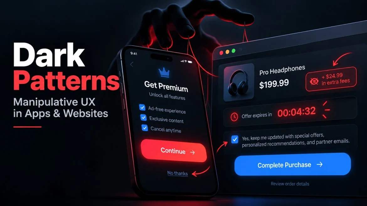
Dark patterns are interface choices designed to steer users toward actions they might not otherwise take. They appear in shopping flows, subscription screens, social platforms, mobile games, financial apps and other digital services where a click can affect money, privacy or account settings.
The technique is often subtle. A bright “Accept” button may sit beside a faint “Manage settings” link. A countdown timer may create urgency even when the offer is not truly limited. Cancellation may require several screens while sign-up takes one tap.
Modern software does more than display information. It structures decisions. That is why understanding deceptive design matters.
What Are Dark Patterns?
A dark pattern, sometimes called deceptive design, is a user-interface technique that interferes with clear and informed choice. Instead of helping users understand their options, the design may hide information, add friction to an unwanted action, create false urgency or present one option far more prominently than another.
Not every inconvenient interface is a dark pattern. Poor navigation can simply be bad design. The concern is strongest when a pattern repeatedly pushes users toward an outcome that benefits the platform while making alternatives harder to see or complete.
The U.S. Federal Trade Commission has documented dark patterns involving disguised advertising, difficult cancellation, buried terms and privacy choices. In the European Union, the Digital Services Act also restricts deceptive interface practices that impair free and informed decisions. Federal Trade Commission
1. Hidden Information
One of the simplest dark patterns is placing important information where users are unlikely to notice it.
A headline may promote a low price while mandatory charges appear only at the final step. A free trial may mention recurring billing in smaller text. A reward may display a large percentage while the rules that determine when it becomes usable sit several clicks away.
Complex products often need detailed terms, but material conditions should be clear before users commit.
2. Fake Urgency
Countdown timers, low-stock warnings and “only a few left” messages can be useful when they reflect genuine availability. They become deceptive when the pressure is artificial.
A timer that restarts after reaching zero creates a deadline that does not really exist. The same applies to repeated “last chance” messages or constantly renewed limited-time promotions.
Artificial urgency can push users to act before evaluating the underlying offer. A transparent interface should make real deadlines clear without manufacturing pressure.
3. Confirm Shaming
Confirm shaming uses emotionally loaded wording to make the less profitable option feel foolish or embarrassing.
Instead of neutral choices such as “Subscribe” and “No thanks,” an interface might use:
“Yes, I want to save money”
versus:
“No, I prefer paying more.”
The user can technically decline, but the wording makes declining uncomfortable. Clear interfaces describe actions rather than judging the person choosing them.
4. Obstruction
Some digital services make joining easy and leaving difficult.
Creating an account may take one minute, while cancellation requires navigating multiple menus, contacting support or repeating confirmation steps. Similar friction can appear when users try to disable notifications, delete stored data, close an account or turn off automatic renewal.
Extra security checks can be legitimate when an action is sensitive. Friction becomes questionable when it appears mainly on the option that costs the business money while the opposite action remains almost effortless.
A useful test is symmetry: if a service can be activated in a few clicks, why does reversing that decision require a dramatically harder process?
5. Preselected Choices and Forced Actions
Another common dark pattern is making the commercially valuable choice the default.
Examples include pre-checked marketing boxes, automatically added services, optional insurance selected in advance, or privacy settings enabled unless users actively change them.
Defaults matter because many users continue without changing them.
Forced actions go further. A service may require an unrelated step before allowing the user to continue, such as creating an account before viewing information that could reasonably be shown without registration.
Ethical design makes optional choices genuinely optional.
6. Hidden Complexity in Financial Offers
Dark patterns become more serious when interface design affects real money.
Financial products, mobile games, trading apps and gambling platforms can all contain offers whose headline is much simpler than the rules underneath it.
Casino bonuses provide a useful example. A promotion may show a wagering multiplier while different games contribute at different rates. CasinoIndex’s explanation of how wagering contribution changes the real requirement shows why the same advertised multiplier can translate into very different amounts of qualifying play.
If one game contributes 100% of each stake toward a requirement while another contributes only 10%, identical wagering on the second game advances the requirement much more slowly. The headline multiplier has not changed, but the practical effort required to satisfy it has.
The same principle appears elsewhere. A “0%” financing offer may have eligibility rules, a subscription discount may apply only to the first billing period, or an investment app may emphasize a reward while placing withdrawal conditions elsewhere.
Conditions that materially change the value of an offer should be visible near the headline claim rather than buried after commitment.
7. Labels That Hide How Balances or Rewards Behave
Interfaces can create confusion by using one familiar label for funds that behave differently.
A displayed balance might combine withdrawable money, promotional credit, pending rewards or funds subject to additional conditions. To a user, the total may look like one amount even when different parts follow different rules.
Casino bonus systems provide a clear illustration of how cash and bonus balances behave differently. Sticky and non-sticky structures can affect which funds are used first, whether promotional credit can become withdrawable and what happens when a user cashes out or cancels a promotion.
The same UX problem can appear in loyalty apps, marketplaces, gaming economies and financial dashboards. If two balances have materially different rights, expiry rules or withdrawal restrictions, the interface should not make them look interchangeable.
Simpler Terms Can Reduce One Layer of Friction
Removing one complicated condition can make an offer easier to understand, but it does not automatically make the entire product simple.
For example, wager-free casino rewards and their terms remove traditional bonus playthrough from the reward itself. That eliminates one layer of promotional complexity, but other conditions may still exist, including eligibility rules, release schedules, expiry periods, account checks, deposit turnover or withdrawal requirements.
That distinction matters because simple marketing language can create assumptions that extend beyond what the offer actually promises.
The same principle applies elsewhere: removing one fee or restriction does not mean every condition disappears. Good interface design makes the remaining conditions visible.
Why Dark Patterns Work
Dark patterns exploit ordinary human behavior rather than unusual mistakes.
People scan pages quickly, continue with defaults, respond to urgency and tend to click the most visually prominent option. Few people read every word on every interface.
That is why visual hierarchy matters. Designers decide which information appears first, which button is largest, which option requires another screen and which warning is visually muted.
Good UX uses that power to reduce unnecessary effort while preserving informed choice. Manipulative UX reduces effort for the platform’s preferred action while increasing effort, uncertainty or emotional pressure around alternatives.
How to Recognize a Dark Pattern
Users can identify many deceptive patterns by asking:
- Is important pricing or eligibility information visible before I commit?
- Are accept and decline options presented with similar clarity?
- Does a countdown represent a real deadline?
- Can I cancel, unsubscribe or delete an account without unnecessary obstacles?
- Are optional extras selected automatically?
- Does a displayed balance distinguish cash from credits, rewards or pending funds?
- Would I make the same decision if every important condition were shown in one place?
A single unusual design choice does not automatically prove manipulation. Security, fraud prevention, regulatory requirements and technical limitations can create legitimate friction.
The stronger warning sign is a repeated pattern where the platform’s preferred action is consistently easy while the user-protective alternative is hidden, confusing or slow.
What Ethical UX Looks Like Instead
Ethical design can still sell products, promote subscriptions and encourage sign-ups. The difference is that persuasion should not depend on obscuring the decision.
Better practices include clear prices, readable disclosures, truthful urgency, neutral button labels, straightforward cancellation, unselected optional extras and visible distinctions between different types of balances or credits.
Material conditions should appear when they become relevant rather than being technically available somewhere in a long terms page.
The strongest interfaces let people see both the benefit and the cost of an action before they commit. That can create something more valuable than an accidental click: trust.
Final Takeaway
Dark patterns are not simply unattractive interfaces or aggressive marketing. They are design choices that make one path easier by making another harder to understand, find or complete.
Common examples include hidden information, fake urgency, confirm shaming, obstruction, preselected options, hidden financial complexity and misleading balance labels.
As more decisions move into apps and websites, interface design increasingly shapes how people spend money, share information and manage accounts.
The best defense is not to distrust every button. It is to recognize the point where design stops helping users make a decision and starts trying to make the decision for them.