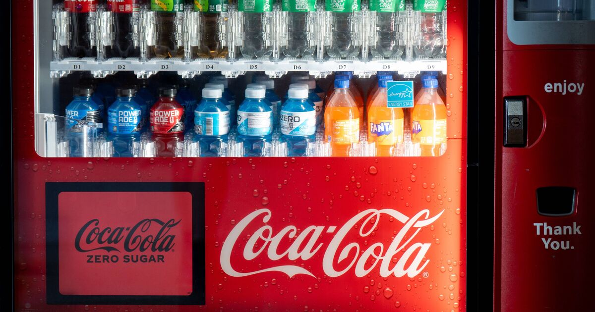
Most of us can look at the same logos for years and never really see them. They’re so familiar that we barely register the details – until someone points out a hidden meaning and suddenly it’s all you can focus on. It’s like the bear tucked into the Toblerone mountain, or Amazon’s curved arrow that signifies parcels being moved from A to Z.
Little touches like that are designed to work in the background, planting an idea in your head without you even realising. And a key example of this is Coca-Cola.
The Coca‑Cola logo dates right back to the brand’s earliest days. The “Coca‑Cola” name was introduced in 1886, and the famous flowing script logo is generally credited to Frank M. Robinson, who is said to have written it in a distinctive cursive style to make it stand out in advertising.
While the design has been cleaned up and standardised over the years, the core look has stayed remarkably consistent, which is a big part of why it’s still instantly recognisable today.
However, despite standing the test of time, parts of the brand packaging are often overlooked by people who buy Coke bottles.
Richard Lau, president of LOGO.com, which specialises in logo design, says the long sweeping tail under the “C” might not just be there to look pretty. Some reckon it actually looks like a smile – tying in with Coca-Cola’s whole “happiness” message.
He said: “This subtle message may go unnoticed, but it subconsciously creates a positive association with the brand in the minds of consumers.”
Coca-Cola has been around since the 19th Century – but did you know these fun facts? (Image: Getty)
Whether that “smiley” was planned when the logo was first created or not, it’s something the brand has definitely played on. The 2009 “Open Happiness” campaign, for example, fits perfectly with the idea.
Additionally, the “Taste the Feeling” and “Share a Coke” marketing campaigns complement the smiley theme. The former represents the happy ritual of cracking open a fizzy drink, while the second celebrates the joy of human connection.
That said, it’s no surprise that cola fans think the subtle smile is a genius addition. On Reddit, one described Coca-Cola’s design as the “perfect logo”.
Meanwhile, a second said: “Ever since someone told me about the faces in the logo, I can’t unsee it whenever I look at it.” And a third added: “Coca-Cola is a cool logo, that’s why they didn’t change it.”
Five surprising facts about Coca-Cola
1) It began as a “tonic”
Coca‑Cola was created in 1886 by Atlanta pharmacist John Stith Pemberton. Early on, it was marketed in the same way many pharmacy fountain drinks were at the time – as a pick‑me‑up “tonic”.
2) A Coke really did cost five cents for decades
The famous 5-cent price wasn’t just a catchy line. In the US, Coca‑Cola was sold for five cents for a long period, helping it become an affordable everyday treat.
3) Coca‑Cola has been to space
Coke even made it into orbit. Coca‑Cola was consumed on Space Shuttle missions in 1985, and special packaging was developed so astronauts could drink a fizzy drink in zero gravity.
4) It helped cement the modern Santa image
Coca‑Cola didn’t invent Santa Claus, but its 1930s Christmas advertising is widely credited with helping to popularise the warm, jolly Santa many people picture today – including the red-and-white look.
5) The name is pretty literal
The “Coca‑Cola” name is generally credited to Frank M. Robinson and refers to coca leaves and kola nuts. He’s also widely credited with backing that spelling because he thought it looked better in advertising.