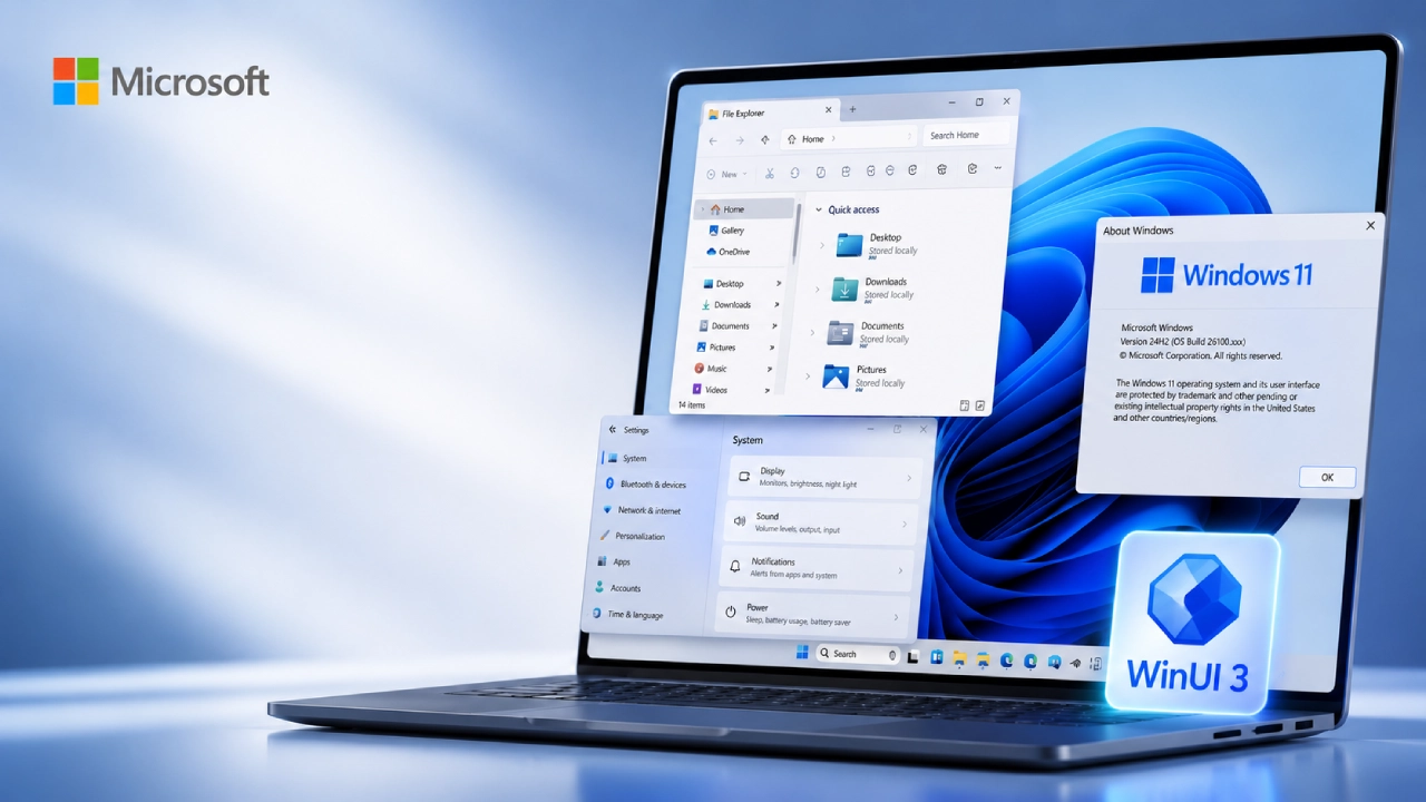
Honestly, Microsoft seems to be paying renewed attention to one of Windows 11’s most noticeable weak spots: its inconsistent user interface.
Even if Windows 11 rolled out a substantially refreshed design compared with earlier versions, a bunch of system parts kept leaning on older interfaces. So users can still end up in dialogs and management tools that feel like they’re straight out of Windows 8, or even earlier.
Based on Microsoft’s newest Windows 11 UI modernization efforts, which Windows Central’s Zac Bowden has been pointing out, the company is apparently committed to reworking several legacy Windows components. The goal is to use modern Windows 11 design principles and frameworks. Like, the “updated” look across the board, more or less.
Windows 11 UI: Getting a Modern Design
One of the clearest examples is the File Properties experience inside File Explorer.
That Properties window has stayed fairly unchanged for years, which makes it one of the most obvious signs of Windows’ fragmented design language. Now Microsoft is working on a modernized version, something that lines up better with the rest of Windows 11.
The redesign is expected to bring a cleaner interface, but still keep the information and controls users actually expect from the current Properties dialog.
This matters a lot too, because File Explorer is one of those most frequently used Windows components. When its Properties view abruptly drops into a more older-looking style, it’s the kind of thing that makes the whole operating system feel a bit less unified.
Print Management and Other Older Components Follow
Microsoft’s modernization push is not just about File Explorer or anything. Print Management, that MMC-based Windows utility, is one of the legacy bits being folded into the modern design world too. Historically, it kept this older style interface, and it kind of clashes with Windows 11’s rounded corners, refreshed typography, and that more current visual language.
Microsoft is also aiming at the older Windows 8-era pop-ups and dialog boxes, as part of the same broader revamp. They might look like small changes on their own, but add them up and Windows 11 could start feeling a lot more uniform. More consistent, like everything is finally speaking the same design “language”
Start and Run Are Also Being Rewritten
Some other key Windows components are getting attention as well, especially Start and Run. As Bowden shared, Microsoft is working on a rewrite of these using WinUI 3, Microsoft’s modern Windows app UI framework.

By moving those parts to WinUI 3, Microsoft can align them more closely with the visual and technical setup that newer Windows 11 experiences use. And yeah, this is not only cosmetics. A contemporary framework helps it implement consistent behavior, scaling, accessibility, and theme support across the operating system parts, without so much duct tape, if you will.
WinUI 3 Is Getting More and More Central to Windows’ Future
The fact that WinUI 3 is being used more often shows a bigger idea in Microsoft’s Windows roadmap, sort of a quietly obvious strategy. Instead of maintaining several generations of UI tech, Microsoft seems to be steering more of the system experience toward its modern framework.
That said, it’s not an easy swap. Windows carries around decades of legacy code, old APIs, and tangled dependencies, and some older interfaces are so woven into the operating system that Microsoft can’t just replace them overnight, or even in a clean rewrite. They still need to think hard about compatibility with existing apps and workflows, which is why the transition drags a bit.
So, that’s basically why Windows 11 still shows a mix of modern and older interfaces, even years after launch. Everything isn’t fully in the same “look and feel” phase yet, and you can notice it.
A More Consistent Windows 11 Experience
One of the clearest advantages of Microsoft’s redesign effort is consistency. Windows 11 already has a strong visual identity, built on rounded corners, modern icons, refreshed typography, translucent styling , and better dark-mode support. But that overall identity can fade when users jump into certain system dialogs or admin tools.
Then the whole experience can start to feel like well, like several different versions of Windows stitched together in one place. Modernizing those remaining parts could help everyday interactions feel more refined, polished, and less jarring.
Like for example, opening a file’s Properties, dealing with printers, or launching system utilities. Ideally those actions should feel like they belong to the same Windows “generation” rather than bringing up an interface that feels like it came from another era.
Microsoft still has a long road ahead
Even with the progress, Microsoft’s Windows 11 redesign is, honestly, far from complete. There are still a lot of legacy applications, dialogs, and system-management tools that rely on older technologies. Some of these parts will probably be way more difficult to modernize than others, mainly because they are deeply baked into Windows, like really embedded.
So the company seems to be going at a gradual pace, sort of mapping out individual experiences and rebuilding them piece by piece, instead of trying to swap everything out at the same time. That also means users should not expect every lingering legacy interface to vanish in just one Windows update.
Why this matters for Windows 11 users
UI consistency might not feel as exciting as AI features, performance boosts, or security patches, but it definitely affects daily usability. Windows is used for everything, from basic file handling to more advanced professional applications and even system administration. When interfaces act or look very different from one another, people end up adjusting again and again to new layouts, controls, and little behavior quirks.
A more unified design can make the whole operating system feel smoother, more predictable, and generally more “natural” to use. It may also help Windows 11 build a stronger identity, as Microsoft moves further away from the visual language that came from Windows 8 and Windows 10.

Conclusion
Microsoft’s renewed focus on Windows 11’s legacy interface could fix, at least in part, one of the operating system’s most annoying design issues.
With File Properties, Print Management, those older pop-ups, Start and Run in the mix, Microsoft is slowly swapping out some of the oldest Windows bits for newer interfaces that lean on WinUI 3 and the current Windows 11 design language.
Still, there is a lot of road left ahead, especially because Windows has an enormous legacy codebase and real compatibility demands. But the path is pretty clear: Microsoft wants Windows 11 to feel like one cohesive operating system, not a patchwork of interfaces from different time periods. For people who use Windows and have spent years thinking, “why does my modern Windows 11 desktop sometimes spit out a dialog that looks decades old” , this is at least encouraging news.