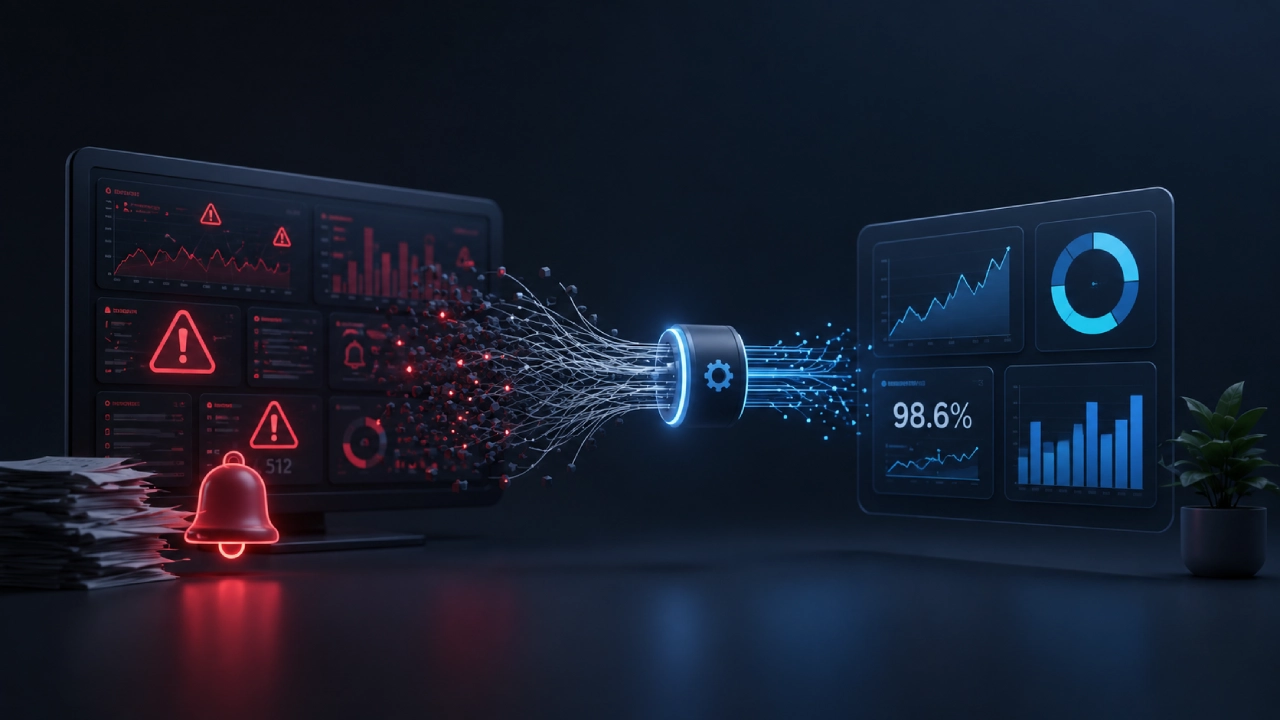
Most companies think they’re fast and they’ve bought the dashboards. They’ve installed the streaming pipelines and got the blinking lights and the real-time monitors.
But they’re drowning. Drowning in delayed batch reports that show up when it’s already too late, due to lack of real-time data, since the data arrived fast but it means nothing, and there’s this illusion of speed while the decisions are made on yesterday’s numbers.
Your “real-time” dashboard is showing you what happened three hours ago. At the same time,e today’s fire burns in another part of the building.
Lack Of Real-Time Data: The True Cost of Lagging Insights
| Section | Key Challenge / Reality | What Doesn’t Work / Bad Approach | What Actually Works / Best Approach |
| Streaming Data & Ingestion | Pipelines breaking at 3 AM; network spikes; out-of-order messages. | Relying on glossy architecture diagrams and ignoring messy operational realities. | Building resilient systems and accepting that bad data streaming faster is just accelerated failure. |
| Batch vs. Stream | Balancing speed, infrastructure cost, and system complexity. | Pretending to run real-time while relying on slow, outdated daily batch loads. | Matching the data delivery speed to the actual business requirement without building unnecessary nightmares. |
| Dashboards & Design | Dashboard fatigue: 50 blinking charts leading to total blindness. | Designing for executives and demos with every metric available on one screen. | Focusing on function over form: showing what’s broken, telling what to do, and hiding non-urgent noise. |
| Single Source of Truth | Different departments arguing over whose numbers on the screen are real. | Assuming everyone seeing the same system automatically agrees on the metrics. | Aligning definitions across finance, ops, engineering, and sales to prevent conflicting interpretations. |
| Alerts & Notifications | Notification overload; engineers getting 1,000+ alerts a day and tuning them out. | Alerting on every minor deviation and waking people up for nothing. | Setting smart thresholds, aggregating before alarming, and alerting only on meaningful patterns. |
| Operational Decisions | Overcoming management fear, paralysis, and analysis paralysis. | Freezing up because data contradicts gut feelings or due to a lack of psychological safety. | Establishing a culture of accountability where data guides the path and humans have the courage to walk it. |
Every minute you wait is money that walks out the door while you’re waiting for that daily batch job to finish.
The 3 AM Firehose: Surviving the Brutal Reality of Broken Data Pipelines
Let’s get real about what data ingestion actually looks like.
Your pipeline breaks and nobody knows why. The logs say one thing, the system says another, and your on-call engineer is trying to debug while half-asleep. This is the reality of streaming data.
| The Messy Reality of Pipelines | Why It Hurts |
| Pipelines break at 3 AM | On-call engineers burn out |
| Schema changes mid-stream | Everything fails silently |
| Network latency spikes | Data arrives out of order |
| Duplicate messages | Counts are always wrong |
| Missing data | Nobody notices until morning |
Batch vs. Stream Showdown: Stop Pretending You Are Running Real-Time
| Aspect | Batch Processing(What most companies do) | Real-Time Streaming(What companies pretend to do) |
| Update Frequency | Daily or hourly | “Real-time” (near-real-time, maybe) |
| Decision Timing | React to yesterday’s problems | React to today’s problems (sometimes) |
| Infrastructure Cost | Lower | Much higher |
| Complexity | Manageable | High operational overhead |
| Actual Speed | Slow | Fast, until it breaks |
| Business Reality | Always playing catch-up | Chasing the latest fire |
Garbage In, Chaos Out: How Bad Data Accelerates Massive Failures
| Data Problem | Streaming Amplification |
| Duplicate records | Counts and metrics become wildly inflated. |
| Null values | Critical business decisions are made on empty fields. |
| Schema mismatch | Processing pipelines crash repeatedly and drop data. |
| Out-of-order events | Your “real-time” operational view becomes completely inaccurate. |
| Missing timestamps | Time-series analysis fails, rendering the data entirely useless. |
Dashboard Fatigue is Killing Your Response Time: How to Design for Humans, Not Demos
Dashboard Fatigue
Staring at 50 blinking charts leads to total blindness. This isn’t a metaphor, but a documented phenomenon.
| Dashboard Symptom | What It Actually Means |
| 50 charts on one screen | Nobody knows what matters |
| Every metric is red | Alert fatigue sets in |
| Beautiful design | Probably not useful |
| Constant blinking | Just noise now |
| Nobody looks at it | It’s decorative |
Design for Humans
Building screens that actually work. What does that mean?
What a good dashboard does
- – Shows you what’s broken right now
- – Tells you what to do about it
- – Hides everything that isn’t urgent
- – Gets out of your way
What a bad dashboard does
- – Looks pretty in demos
- – Impresses executives in meetings
- – Has every metric available
- – Makes you work to find problems
The Myth of the Single Source of Truth: Why Everyone is Looking at the Same Screen and Arguing
That mythical single source of truth. Everyone begs for it. Nobody actually has it.
Finance looks at the screen and swears we pulled $1.2M. They forgot to check the backlog of unprocessed transactions sitting right there.
Meanwhile, Ops claims 98% uptime while the whole system is crawling like molasses. Engineering screams about 50ms latency, ignoring the fact that they’re only pinging a single lonely region. Sales is celebrating 200 new leads, half of which are just duplicate entries nobody bothered to clean up.
Everyone’s staring at the exact same dashboard and arguing about whose reality is real.
Then the notification spiral hits.
- 100 alerts a day
Teams read every single word.
- 500 alerts a day
People start skimming or just checking things selectively.
- 1,000+ alerts a day
Notifications get totally ignored.
- 5,000+ alerts a day
Folks just turn the whole damn thing off out of sheer exhaustion.
And honestly, getting a warning is only half the battle. Human beings still have to do something about it.
- Timing is trash, usually waking up a half-asleep engineer at 3 AM who takes forever to react.
- Volume buries everything important under a mountain of noise.
- Preparedness evaporates the second there is no clear runbook, forcing everyone to just wing it mid-crisis.
- Confidence drops to zero because nobody wants to touch a button and accidentally break production worse, leading straight into analysis paralysis.

Reclaiming Analytics: Build Systems for the Trenches, Not Monuments for the Boardroom
Tools don’t fix broken processes.
You can buy the most expensive streaming platform. You can build the most beautiful dashboards. You can set up the most sophisticated alerting system. But if your processes are broken, you’re just failing faster and with more data to prove it, and no real-time data could make up for it.
Stop building data monuments for executives to admire.
Stop building expensive data monuments that nobody looks at and start empowering the people actually fighting the fires. Audit your pipelines, slash your alert volume by 90%, and redesign your dashboards for decisive action today, because true speed is about how fast your people can win.