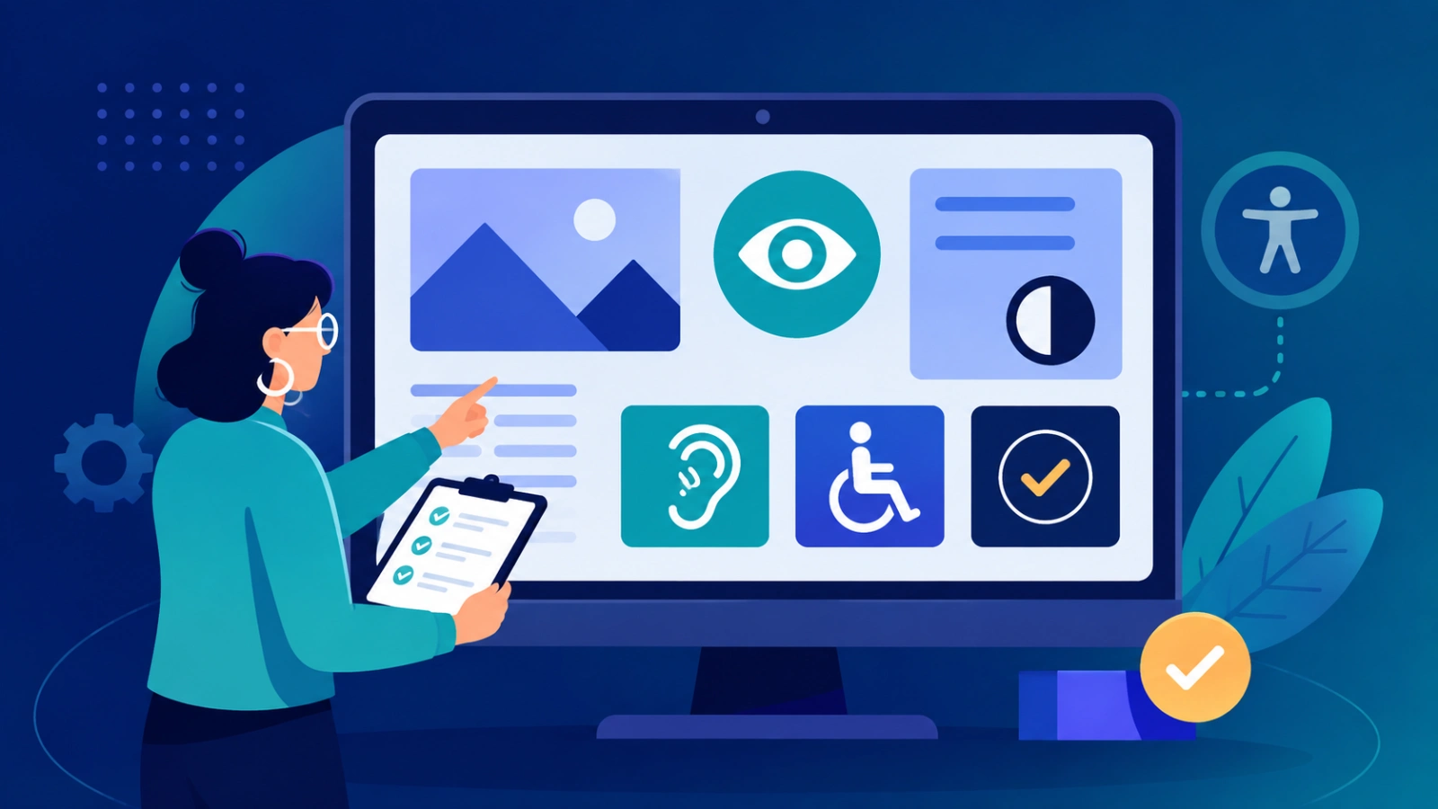
Testing helps teams spot issues that stop people from using a product. It also makes the software steadier and easier to use. Screen readers are one key area. Teams should check how pages are read, how labels are handled, and whether headings and links make sense. Keyboard checks matter too. Testers need to confirm, using accessibility testingthat users can move through controls in order, see where focus is, and reach every action without a mouse.
Color contrast is another common gap. Contrast checks should cover text, buttons, and key UI states so content is not lost for people with low vision or color confusion. Teams can also run audits with tools. These checks catch many frequent issues, but they do not replace human review. Real user feedback still matters.
Accessibility connects to overall software quality. If an interface is hard to use, people may not finish tasks, even if the features work in theory. It is usually best to test early. Fixing issues during build time costs less than addressing them after release. Inclusive UX helps more than one group. It supports people who have temporary limits or face odd situations, not only those with permanent disabilities.
What Is Accessibility Testing?
Accessibility testing means checking software to find barriers. These barriers can affect people who have disabilities. The check covers how features work and how content is shown.
Common areas include:
- Using the keyboard only
- How screen readers read pages
- Color contrast between text and backgrounds
- Zoom and text resizing behavior
- Forms and form fields
- Images and their alternative text
- Headings and the order of page section
- Where the focus moves on the screen
- Buttons, links, and other interactive parts
- How error messages are presented
- Audio and video content
This work can be done in different ways. Some tests use automation. Others are done by hand. You can also test with real people. Using more than one method helps. Automation spots issues that tools can detect. Hand checks help a tester feel the interface through real interactions. Real users often notice problems that developers did not expect. The aim is not just a higher accessibility score. The aim is to see if people can finish key tasks without getting stuck.
Accessibility Is Really Part of Software Quality.
Some teams treat accessibility like a side task.
They act as if it sits apart from normal development. That view does not match what happens in practice. When an app has accessibility gaps, it often points to other issue too. For instance, a bad layout can trip up a screen-reader user. It can also make code harder to work with later.
Unclear errors can annoy people who use assistive tools. They also upset people who rely on a sighted view. Focus problems are similar.
They can hurt keyboard users, and they can hurt others who do not use a mouse. Good accessibility usually comes from the basics done well. Clear structure helps. Stable behavior matters. Communication between the interface and the user matters. So accessibility fits inside solid engineering, not an afterthought.
Screen Reader Checks: Does The App Communicate Well?
A screen reader is an assistive tool.
It turns on-screen content into speech or another kind of output.NVDA, JAWS, VoiceOver, and TalkBack are common examples. To work well, the software must reveal useful details. It has to show what each control is for and how the page is set up.
A person using a screen reader should be able to tell:
- What a button does
- Where a link goes
- What a field needs
- Which heading they are on
- If a dialog has appeared
- If something went wrong and raised an error
How well this works depends a lot on the HTML and the built-in accessibility meaning. So a custom interface that looks polished can still fail if it hides structure from assistive tech. That is why screen-reader testing is so valuable. It shows an experience that normal visual checks miss.

Keyboard Access Check: Try It Without a Mouse
A good test is also a basic one. Use the app with only the keyboard. Keyboard users should be able to get to key controls and use them.
You should be able to reach things like links, buttons, fields, and other interactive parts.
Try these keys:
- Tab to go to the next focus item.
- Shift + Tab to go back.
- Enter or Space to turn on the focused control.
While you test, check that you can move through menus and sites with tabs. Also see if you can fill out forms, open dialog boxes, and send or confirm information. Make sure you can reach the main actions that matter. Standards like WCAG cover keyboard access.
They also cover keyboard traps. A keyboard trap happens when focus lands in a part of the page and then you cannot leave it with the keyboard. This test can show another problem too: focus visibility. If the page does not clearly show where focus is, the whole interface feels hard to use. On a busy screen, it becomes even more confusing.
Focus Handling In Today’s App Screens
Focus matters a lot when an interface is driven by JavaScript.Think about a dialog that pops up.
At that moment, people should realize the page has changed. The keyboard cursor should jump to the right place. They should be able to use the dialog controls without trouble. They also need an easy, expected way to shut it. After closing, the cursor should go back to where they were on the page.
This same issue shows up in many other UI pieces, like:
- Drop down menus
- Autocomplete inputs
- Shopping carts
- Multi stage forms
- Alerts and messages
- Apps that do not reload the page
When focus moves in a way people do not expect, it can feel confusing. If focus does not shift when it should, that can block progress too. So accessibility checks should look beyond “can this element be focused. ”They should also test how focus acts in real use. From the user’s view, the behavior should make sense and stay consistent.
Completing Forms Can Take Longer Than People Expect
A form grabs attention for a clear task.
It lists the steps in one area.
Teams often rely on forms to do the basics:
- set up an account
- buy something
- ask for help
- pay a bill
- contact support
- book an appointment
Forms can cause trouble when field labels are easy to miss. It also goes wrong when errors show no real help. If someone cannot use a keyboard to move through the fields, they can get stuck. After that, the whole path breaks. The user stops.
Good forms use labels that stand out. They should be easy to scan. The page needs error text that sounds normal, not pushy. When a mistake occurs, the message should be short and plain. Hints should fit the exact step the person is on. Test the full journey each time. Do not check only one box and stop. Run the whole sequence from the first screen to the final submit.
It is not only about passing technical checks.
The key question is simpler: can a new person complete the form by themselves?
Use Simple HTML First For Better Access
Pick tags that match the job.
If the text is a heading, put it in a heading tag.
If the action is a click, use a button.
If you need to move to another page, use a link.
For menu items, keep the navigation neat and clear.For inputs, add a label that fits.
With this layout in place, browsers and assistive tools can spot each part and its role.
The same setup also helps when you return to the code later. A component built with plain HTML is often easier for others to read. It can beat a blend of generic blocks plus lots of script work.
In real projects, good access work and good frontend work usually go together.
Automated Checks For Accessibility
Automatic testing is now a normal part of software work. With the right tools, a team can scan pages and spot issues like these:
- Labels that are missing
- Low color contrast
- Broken or invalid attributes
- Structural problems in markup
- Some keyboard traps or focus issues
- Alternative text that is absent on images
These checks are useful in continuous integration. When new code lands, the team can catch breakage early. Still, automatic testing is not enough. A scanner might report that image alt text exists. But it may not say if the text helps a reader. It might also say a button has an accessible name. Yet it cannot tell if that name fits what people expect next.
It can confirm technical rules too. But it cannot judge if an interface feels clear in real use. The W3C guidance has long said to pair automation with human reviews. It also suggests testing across browsers and assistive technologies.
Accessibility Testing Through the Whole Build Process
Accessibility works best when you start early, not at the last testing step. In the design phase, the team can pick good color contrast and clear interaction rules. In development, engineers can build with semantic HTML and use UI parts that already support access.
In QA, testers can run automated checks and also try the site with only the keyboard and a screen reader. After launch, the work does not end. Teams can watch for reports and fix new issues that show up.
You can think of it like a chain:
Design, then Development, then Automated checks, then Manual checks, then Testing with users, then Release, then Ongoing fixes
The benefit is not just practical. It also saves money. It is usually simpler to correct an access problem while the feature is still being made.
Trying to fix it later, after many users rely on it, costs more and takes longer.
Conclusion: Making Software Easy To Use Also Makes It Dependable.
Accessibility checks should not be something teams save for the last week before launch.
It belongs in day to day development, not as a rushed afterthought. When you run screen-reader tests, you can see if key content is understood the way it should be. Keyboard checks show whether someone can move through the site and use it without relying on a mouse.
Contrast checks matter too, because text and controls must stand out clearly on the screen.
Automated scans can quickly point out frequent bugs and missing fixes across many pages.
Still, manual testing and feedback from real people often uncover issues that tools do not catch.
Using every method at different stages gives the best view of what is actually working. As digital tools take on a bigger role in daily tasks, accessibility and software quality are linked.
A site or app is only reliable if users can reach the features they need and complete what they came for. Inclusive software is not just meant for more users. It should be built so fewer people get blocked.